Archives for the month of: February, 2011

P1564

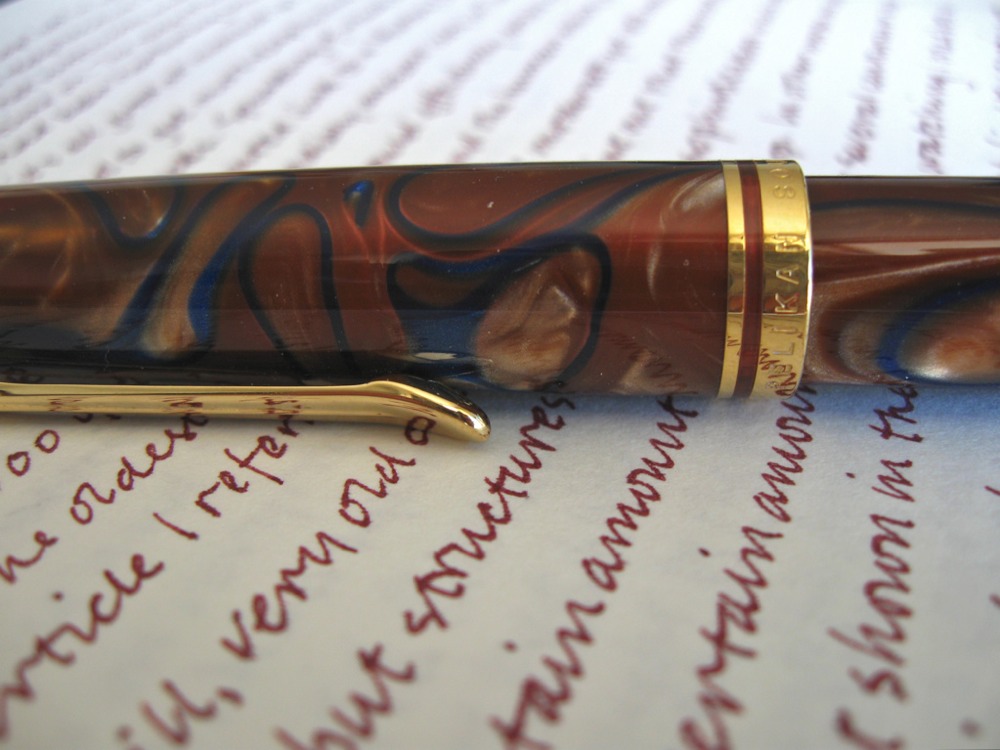
…to plow another field of dreams. I’m actually a little embarrassed at possessing the Pelikan M620 Grand Place because it’s so swirly and “pretty.” I got it really cheap — is that a good excuse?

I had been using the M605 with sharp Binder italic so swapping out to this blunter cursive is like eating candy. Ink is that strange first batch of reddish purplish Nakahama Manjiro that Jetpens carried for a while.

P1553P1555P1557P1559

iPad screenshots from PBS documentaries: Plato burning the midnight oil writing “Atlantis” with a stylus and tablet of some kind. I don’t know anything about this sort of writing so I don’t know how authentic this is (or isn’t).

Then comes Michaelangelo and his pen pal. Quills here and they have to leave the feathers on so modern audiences will get that they are quills even though in real practice they stripped the feathers off leaving only the quill shaft. Michaelangelo is shown writing with his left hand — I didn’t know he was a left hander until I looked it up after seeing this.

And his pen pal — I forget the name, sorry.

Everyone in the old days seems to have written at night to take advantage of the poor lighting. I can’t even imagine anyone writing in daylight!

P1547

…nib — Richard Binder .5mm “cursive” italic — laying down some Sailor Kiwa Guro nano-carbon black on Kunst & Papier journal (“sketchbook”). Also doodling on a Japanese Combine notebook. In classic “Engrish” it describes itself as “The note book having horizontal ruled line and being able to fold up is the best for arranging sentences.” Can’t argue with that!

The Binder nib was specified as a cursive italic but it is the sharpest cursive italic of the dozen or so I’ve gotten from Mr. Binder. I’m pretty sure this fell into the wrong bin and is a sharp italic. It is very difficult to write with and I almost returned it. Instead I thought I’d challenge myself and learn how to handle the thing properly. As you can see, still learning…

P1542

I’ve been using the M200 for the last seven days. Dropped it on the page yesterday where it burped some ink on the page. When I got to them, I just wrote around them, but I’ve also drawn little cages around them in the past. I think I like ink drop cages better. It looks neater.

What do you guys do?

Image

P1534

P1522

…the M605 again with the Binder .5mm cursive italic installed. For some reason, this .5mm is wider than my others from Mr. Binder. For a moment I was even thinking of returning it. But I think I’ll keep it. I’m trying to adjust my writing to it and it might take a few days to find how it likes to be held. I just noticed that everything is blue. I’m using a deep blue Kunst & Papier journal (sketchbook I think they call it), the M605 is dark blue, and the ink is my own blue-black mix of Noodler’s bulletproofs I call “Midnight Rain.”